The Size and the Software, I predict, will be the key points dictating whether or not I could adopt this lovely-looking 5G phone, eventually getting it in-hand a year after release, which was spring 2021. The main reason for my interest was the microscope lens and ring-flash, totally unique in the 'phone world and subsequently dropped by the firm in this year's model, the Find X5 Pro.
Oppo is a part of the Chinese BBK Electronics firm who also own the Vivo, OnePlus, Realme and iQOO brands. Until recently, we in the west didn't routinely see many of these phones but we're beginning to now more widely. Not being on the Oppo loan-circuit for reviewers we at Phones Show Chat often have to 'bide our time this end - and end up having to buy our phones to review. This time, acquired from one of our MeWe Group members. They're a great crowd and if you're not already a member, do come and join us. Links to all our Groups in MeWe and audio Podcasts can be found on my website at tedsalmon.com.
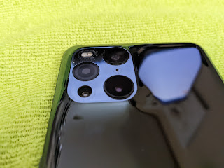
Anyway, on with my thoughts about this phone and as usual, we start with first impressions. It is a large phone which many people on release were comparing with Samsung's S-series 'Ultra' models on that basis, but also as a likely 'closest competitor' for potential purchasers. It's beautifully crafted with that 'moulded' 4-camera cluster taking centre-stage. It has a gentle 'slope' on all sides up to the platform, a millimetre or so from the line of the rear panel. It really does have a classy look and feel to it even if the gloss black version here (which actually looks more like grey - or even just a mirror) is a serious fingerprint magnet! Still, a TPU in place and you'll have to get it out to enjoy it fully anyway!
The back is Gorilla Glass 5, so you really need that TPU on, as it'll drop and break. However, for those brave enough, the glass really is quite 'grippy' and not like a slippery bar of soap when in use - obviously depending on the amount of natural moisture in your skin. The back curves round slightly on all four edges to meet the aluminium frame and the front-side edges do similar, to a lesser degree. The power button is on the right (with a neat green accent) and volume buttons, left. They all feel like they're well made and not 'floppy' in any way.
The top of the phone has nothing much, just a microphone, but down the bottom there's a USB-C port, one of the stereo speakers, another microphone and a Dual-SIM Card Tray (double-sided). The microphone hole is placed right alongside the SIM Card Tray which looks just like a tray-eject hole. I wonder how many people with these units now have knackered microphones!
The front of the phone is all-but flat and has the look and feel of a Samsung phone these days, having moved away from outrageous-looking slopes and edges. Up the top there's the second speaker between the frame and Gorilla Glass 5, doubling up as the phone's earpiece speaker in the usual way these days. The bezels around the front panel are very small, slightly more on the chin than forehead - but there's not much in it - and what there is around the sides is hardly visible.
I did think that the phone could well be too big for my liking, but even though it's a shade taller than my Motorola Edge+ (2020) and a tad wider, it doesn't feel as big somehow. I think it's because it's thinner and lighter at 8.3mm and 193g. The whole package in the hand just seems more manageable. Time will tell how I find it for one-handed use, but it seems deceptive anyway. It almost feels strangely rugged too though, supported by the psychology of knowing that it has IP6/8 certification no doubt. Don't get me wrong, this is glass and not a Nokia XR20 you can play football with - all these observations are just look'n'feel ones.
The front panel is a 1440p 6.7" LPTO AMOLED one with a 120Hz refresh rate, 20:9 ratio and 525ppi. Like my Motorola Edge+ (2020) it supports one billion colours (because of course, 16 million is just not enough) and 10-bit colour. It's HDR10+ certified and has a 240Hz sampling rate. It's superbly bright and colourful and can apparently reach 1300nits at the peak. The gold standard for me here is the wonderful screen on the Edge+ and this doesn't quite match it, though it ain't far off.
The refresh rate can be switched between 120Hz and 60Hz - then confusingly claims that it's 'dynamic' so even if you choose one or the other it does what it thinks is best anyway! I can't tell the difference - no, really. I'd save battery every time. If you want to tinker with the colours, there's a choice between Vivid (enhanced), Natural (soft) and Pro (cinematic or brilliant). Then there's a warm/cool slider for white balance. There's even a bunch of filter-settings for people who have colour-blindness - and a testing routine for everyone to do if they want to, ending up with a 'personalised' colour setting system-wide. I went through this, then compared the resulting colours with default and there is a difference, though I actually preferred the default - so not sure what use this is really! Maybe more so for people who do have eyesight issues. Then there's an auto-adjustment which will tweak things based on ambient lighting and the Ultra Vision Engine which enhances video and brightens HDR. Finally, there's a switch between 1440p, 1080p and Auto for the user to select. Again, I can't tell the difference, so I put it on Auto and let the AI decide!
There's an under-glass fingerprint scanner which I find to be fast and accurate. It's an optical one, but as optical ones go, it don't get any better! It's way ahead of the Motorola version and Samsung too in my testing. It's supported by a very fast and accurate face-unlock system and the whole security to-get-in seems well thought out with options for a lock-screen pause or not. There are animation options for when the finger is pressed to the glass, as the fingerprint scanner does the business.
Continuing with the screen, it is also supplied with Samsung-style Edge Lighting, but it's much more basic with a slim choice of colours and one pulsing array - so take it or leave it! You can hide the Status Bar under a black band on a per-app basis, but not, it seems, globally. There's also an Always on Display, which is great, but like the Edge Lighting, not a patch on what Samsung offer. There are a few choices, animations, clocks, text-input for message and so on, but nothing like the same rich control from Sammy! The AoD is also not controllable for brightness so sometimes I'm sat in a room with subdued lighting and I can't see it. Move it under a lamp and it brightens up. Algorithms need fixing I guess - as well as possibly the auto-brightness which many phones outside of Pixel and AndroidOne with Android 12 onboard just now seem to be struggling with.
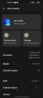
Talking of Android 12, one of the big plus points for this Oppo flagship is the promise by the firm to update it with 3 versions of the OS and 4 years of security. The phone arrived in spring 2021 on Android 11, so it should get Android 14 sometime after autumn 2024 and security to spring 2025. Good show Oppo. Take note Motorola - that's how to treat customers buying one's flagships. As I write in May 2022, the phone has the April 2022 security update and April Play System. So a little behind the leading pack but not too far.
Finding out where to go to check which version you have leads me into the right fiddle of ColorOS Settings again however! The phone has v12 and I await v12.1 as it has some improvements to the PC Connect experience, which I'll come to. For now, it's safe to say that Settings is just a jumbled mess compared to, for example, the Vanilla experience of AndroidOne phones. What makes it worse is that the search engine supplied, is often caught out on simple strings of text to find anything. So the user is up against an illogical folder-structure to begin with, then no quick way to get where they need to be! As always with these complaints, they will be squashed by users, not reviewers, keeping phones and learning where stuff is over time, of course. They are not alone. There are some manufacturers of phones who stick to the baseline (Sony, Motorola, Nokia spring to mind) but many others seem to want to rearrange everything to (presumably) stamp their mark on the way they do it! Confusing for me, but others might argue that this is because there is so much stuff added to the baseline for a much richer experience. The good news for Samsung users is that Oppo have emulated OneUI to some degree here with pull-down headers in Settings, revealing the search engine (for what it is worth) and hints as to what other places you might have been looking for at the foot.
Like others from the far-east, Oppo has added oodles of functionality laid over the top of basic Android - some of which has been ported from OnePlus devices, following their departmental merger. Example being the ability to draw gestures on the 'off' screen to control music play/pause/forward/back and even assign other gestures to apps and functions of the user's choice. I'm not really sure where to start and stop ploughing through all these features of ColorOS12, so I'll try to settle for some highlights.
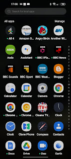
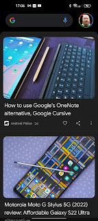
Before I do that, I will first counter my previous argument about ColorOS not being very Vanilla by pointing out some of the ways that, actually, it is! The Google Feed is off to the left of the main homescreen (good) but for those looking for a choice, it's not removable (bad). Gesture Navigation, although it's Oppo's own (with fancy animations) it works pretty much like Google's own with similar options and methods. The screen timeout is the 'standard' up-to 30mins, unlike many others capping it at 10. The Widgets picker is vertical scroll, though getting there is different and more like iOS as you put the homescreen into suspension and work with 'plus' and 'done' buttons. The App Drawer is vertical-scroll but users also have the choice to 'do an iOS' and splatter everything directly onto homescreens. There are settings to pull-up from anywhere to get the App Drawer and pull-down from anywhere for Notifications area.
While we're here, we can see that there are lots of choices for how you want your homescreens to look including a near-Nova level of Icon control, shape, style and sizing and how you want your homescreens to rotate, with animations aplenty. We also have the status bar with the usual icons and layout, except for a few niggles - like there being no way to have the NFC switched on but not have the icon always displayed (unless you disable all the icons). Like the inability to get the battery percentage outside of the too-small battery icon, ditch the graphic and just have the numbers. Like the whole status bar being disproportionately small and in order to make it bigger, only winding up the screen zoom setting which makes everything else stupidly big. But these are niggles.
The Notification drop-down gives us clock and date with a brightness slider (and auto-switch) then meandering away from Vanilla, round buttons instead of the larger ones introduced with Android 12 by Google. They're great though and in many ways better. You can certainly get more on the screen, with oodles of options as to which ones you want on display on initial pull-down. All sorts of controls, modes and switches - very Samsung. The whole colour-theming thing has made it across with Android 12 and icons and graphics can be influenced if you wish by settings for the display in the same way as a Pixel, with a growing number of options. I noticed that this morning there was an update to the palette.
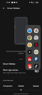
There's a Smart Sidebar, like Sammy's Edge Panel or Sony's Side Sense and so on which does just what you'd expect really. Same as the others. Assign (pretty much) what you like in there up to 20 shortcuts for those who don't want to use homescreen folders, presumably. I never did get with the advantages of this and always turn it off! I except Moto's version from that however, as it also has the functionality of using as a swipe-up/swipe-down for Notifications area/app drawer when you have something other than homescreens using the panel. Not here though - maybe others have this too.
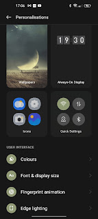
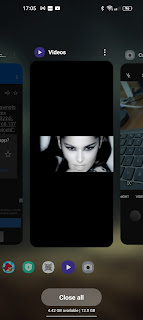
There's a Personalisation area in Settings which groups together (Moto style) various tweaks (which you can get to via other routes too, making it even more confusing), double-tap to wake/lock, lift to wake, various animation controls for navigation, controls for the Recents panel including a snapshot display of icons below the carousel, split-screen options and even a RAM readout at the foot so you know how much of it is being used, then how much you save by closing everything down!
There are battery controls, power saving utilities, clean-up options, useful analysis of power consumption and projection, floating windows to resize and move around p-in-p style, a quick-launch function which gives you a choice of long-press, quick-launch assignable apps via the fingerprint scanner, and even a hide-apps area where a PIN is chosen, app hidden from the drawer, then only appears when the PIN is typed into the phone-pad dialler with a # at each end of it! You get the idea! You'd need a good long time to get stuck into all these features and learn how to use them productively (after you have located them of course)! It's stuffed full of features, loads to play with!
The phone is driven by the SnapDragon 888 5G (5nm) chipset from last year (or was it the year before) so not bang up to date of course, but it's more than capable, remains valid for 2022 and beyond - everything I throw at it flies. The model I have here is the global release with 256GB storage and 12GB RAM but there was also a 512GB version with 16GB and also a 256GB with 8GB in various markets. When I monitor the RAM, I seem to be chugging along using between 5-6GB then if I 'optimise' can get that down to 4-5GB, very similar to the Edge+. It clearly is more than enough and again, hopes going forward for an Oppo DeX-like feature-set to come. I'm glad that the baseline storage is 256GB as there's no microSD Card slot here for expansion.
I'm not much of a gamer, but I did run a couple of car-racing games and it all looks silky smooth to me, not a jutter. There is a Games app from Oppo pre-installed which collects all your installed games into one shortcut location and provides a Gaming Tools side-panel pull-in to control Notifications, performance settings, power, temperature (for which the unit has vapour-chamber cooling) and time spent on session etc. for heavy gamers who want to focus on their important titles!
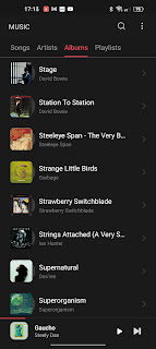
Talking of pre-installed apps and services, Oppo is far from the worst offender in the mobile phone world (as it should be for flagship-priced phones) but there is still stuff included which some may consider 'bloat'. AliExpress, Tile Master 3D and Facebook which can be refused during setup or uninstalled. Doubled-up Google apps which can't be uninstalled (only force-stopped etc.) are Calculator (very similar to Google's), Clock (visually pleasing), My Files and Photos. Apps which are pre-installed but actually are quite useful are Compass (very pretty), Clone Phone (like Samsung's Switch), Music, the aforementioned optimiser and various other tools called Phone Manager, Recorder for MP3 audio, Video and Weather (The Weather Channel). Then there's the standard Google Apps which Oppo has decided to actually use as default - Phone, Contacts and Calendar.
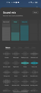
Then there's this thing called O Relax! This is a bunch of audio tools to play all sorts of soothing sounds as background, like rain or waves on a seashore, or thunder or wind - and 'profiles' can be built up and overlaid on each other, so you can have heavy rain at the beach or a crackling campfire with the sound of bats flapping around. It all sounds pretty trivial and a bit of a novelty but actually, I've used it a few times and it's really quite addictive to have going in the background. There was a really sunny hot day last week and I put on the sounds of rain on a roof which made me feel not so hot of course! Jolly psychology at work, but it's all good fun. So, as usual, some stuff that some would call bloat, others might find useful.
One which I would find useful if I had not bought into PowerAmp is the Music app (though it's pretty bare-bones) and without VLC, the Video one. They both do the job nicely enough for the feature-undemanding. This bring me to sound and speakers. The output from the stereo speakers is 'proper' stereo with the same quality and volume from both ends, from what I can tell. They are not up with the best, however, for volume or quality. Compared with my Edge+ the phone sounds a little less rich and a little less loud. Again, I'm nit-picking though, as the average user would, I'm sure, be very happy with the sound produced - even think it's very good. I'm comparing with the best I have here.
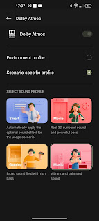
There's an always-on (with speakers) Dolby Atmos with 4 basic switches in the usual way, Music, Movie, Gaming, ‘Smart’. There are no claims for 24/32-bit audio output here. Stereo is balanced well between the speakers from (up to about) 18” away and separation is actually quite good at that distance (testing with YouTube Dolby-test videos), but you are up against the output quality (as above) so OK for casual listening but this is no audiophile’s phone.
Headphones needed to get more control, then. No 3.5mm audio-out here but testing with a not DAC-enhanced dongle and Bluetooth. AKG K702 reference studio headphones first with Nokia 8 Sirocco 3.5mm dongle in use for the cabled test. Full volume is not too loud for me, which is not a good sign! Sound options open up into Environment Profile (Indoor, On-the-Go, Commute and Flight) or Scenario-specific Profile (Smart, Movie, Gaming or Music as above). Or you can turn Dolby off. Depending on what Profile you’re in, there seems little difference really. Then underneath you get to go Custom with an equaliser. Again, adjustments are minimal. Best profile seems to be the Environment>Flight one for bass/volume. Using my AKG K702 headphones with Razer 2 3.5mm dongle all the same as above except that it’s much louder and has more bass, as one might expect with the enhanced DAC in the dongle. Sony's WH-1000XM4 and v5.2 Bluetooth is next and as expected, the whole thing shifts up a big gear on volume, quality, bass - the lot. Too loud for me at full! All the same controls and options available as above. (BTW, the Google Assistant works perfectly with the Sony and this phone, unlike some phones.)
The phone has a 4,500mAh battery inside which I have found to be very reliable and up there with many of the leaders. On a flat reading test I continued for 2 hours and 15 minutes before 10% of the charge was used and on an average day for me I have been recording 14-16hrs between charges with 4-6hrs Screen on Time with still half the juice left in the tank. As always, it depends on how you're using your phone as to how long it will last and shooting 4K video half the day is not going to be the same as someone not doing that! All in all, at a push, I felt as though I could just about squeeze two days out of it between charges.
This brings us to the whole charging issue and SuperVOOC Oppo charging. If you use the 65W charger that comes in the box and the supplied matching cable, you can indeed get blazingly fast charging. I sat and watched it flying up for half an hour from completely flat to full (and 40% in 10mins). Very impressive - and opinion is still divided as to whether or not that's particularly good for the battery. I usually, for the record, trickle-charge overnight. If you don't use the Oppo-supplied gear, it seems to default right back down to 10W, though I have has some middle-ground results using a 100W charger and better quality cable. So your mileage may vary.
Supporting this speedy performance is wireless Qi Charging built-in which works perfectly well on various chargers here and with the right supporting gear, it'll do that at 30W (so 100% from flat in 80mins) - if not, 10W. There's reverse wireless charging which works to top-up other devices on the back at 10W as well.
I was delighted to find that the USB-C socket, armed with an HDMI adapter can send out data to my TV and a connected monitor, as well as having a 'PC Connect' application for Windows PCs which appears to be a work-in-progress. HDMI-Out means that the user can download media from whatever source they like and cable it out to a TV without relying on screen-shares or mirroring options, which often end up with latency issues. Cable is still the robust method in this house! It's no DeX or Ready For, however. You get a basic output which echoes what's on the screen and you can't turn the screen off while you're doing it. You can, however, charge it simultaneously whether by a forked, powered HDMI-USB-C adapter or by plonking it on a Qi Charger. Works perfectly well.
The Windows-based PC Connect software is, again, no DeX or Ready For. It's a basic screen-echo again so you can see your phone's screen in portrait on your computer and interact with it and apps with mouse and keyboard using the PC's speakers/sound. If you have auto-rotate on, then turn the phone round you can get film/video into landscape but the only resize of window option is full-screen, no dynamic. Seems like a bit of a half-way between Samsung/Motorola's solutions and the basic Sony/Nokia output. It feels like it is very much a project in process and, as I mentioned earlier, I read that with ColorOS12.1 there are some improvements coming. I shall be keen to see them.
Testing connectivity here I am unable to do so for 5G - as we don't have any! The 4G cellular connection seems solid with good signal pickup, strong connection and maintenance using VodafoneUK. I hear the other party well on phone calls, and they, me. Data is similar when used - it seems to hang onto that well and provides a stream as dictated by the operator and the same for various WiFi/MiFi routers I have been able to test with. NFC is working fine with connection to other equipment, GPS locks onto locations well and Bluetooth seems reliable and fairly long-reaching. I really don't have any complaints about connectivity. Seems to do a good, steady and reliable job.
As I said at the outset, I was interested in the USP on the camera array here, the microscope with ring-flash. And what fun it has been! After a while, yes, of course, it's become a bit of a novelty wearing thin, but for the occasional tinker now and again with one eye on artistic elements, it's a great tool to have in the box. You can set it to 30x or 60x magnification and when in use, the ring-flash comes on automatically. The light (which is not really a flash at all) stays on and evenly illuminates the subject focused in on, with white light. And gets close! Human hairs are fun to look at and weaves of fibres. If you can catch them, small insects and living things even more so, but yes, you need a steady hand (or some kind of tripod). There are pop-up warnings on the screen which tell you to 'rock' the phone a bit to achieve focus but because the depth of field is so amazingly shallow, it's a tricky job. The shooter is only a 3MP f3 unit so don't expect miracles in terms of image quality - think of it as good fun and you'll have it!
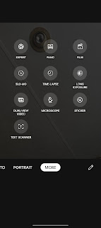
Other than that, we have a pair of 50MP main cameras, one f1.8 with OIS and the other, f2.2 wide-angle without, though it does a pretty good close-focus job. The third is a 13MP f2.4 which is also a 2x optical (and 5x Hybrid) zoom and fourth, that microscope. Round the front is a 32MP f2.4 Selfie Camera. The Oppo Camera App offers all sorts of modes and functions as you'd expect, from text scanner to dual-view video, from time-lapse to panoramic and much more. Making the most of darkness it seems to do a reasonable job though I've not had to hold a phone still for that long before to get it - so long that it ends up blurry. With a tripod it'll be fine. Portrait seems to do a decent job with levels of blur too - but I'm going to hand over to those nice people at GSMArena now for their deep-dive into the photography capabilities of this phone as they can test it more clinically than I - and conclude that it has outstanding photo and video quality. Do support them by clicking through.
I conclude that this is a smashing phone and as is so often the case, a year-old flagship makes perfect financial sense, is often still perfectly functional, helps the environment and makes for a very sensible choice. The Oppo Find X3 Pro has a super screen, it's beautifully built, it's fast and capable with great connectivity and is not too blighted by a medium-sized skin over base Android with plenty of smart bells and whistles for the long-term user to get to know and love.
There are great charging options, more than adequate battery and what seems like a more than capable camera setup with that unique-to-phone microscope option for plenty of fun. The speakers are full stereo and even though not up there with the leaders, are not far off pleasing all-but the very picky with sound via Bluetooth excellent, depending on connected equipment.
This year's replacement does away with that microscope camera so if you want one of these, grab it while you can - in the sure knowledge that Oppo have promised to update the phone for three OS versions and four years of security. A sound investment until 2025, even for second-hand buying, now. I started my thoughts here with the software and the size. As I said above, the size is surprisingly manageable and as for the software, of course, if this was my primary phone I could get used to it and find my way around the settings in time. Highly recommended for those prepared to do some stuff the Oppo way!






thanks Ted, a very informative review as always.
ReplyDeleteTed, there appears to be something wrong with the mobile version of this page such that my attempt to post a comment did not work.
ReplyDeleteAnyway, I had had a similar experience with my wife's Moto G7 Plus, where the microphone opening with situated uncomfortably close to the external hole on the SIM card tray. And the two openings looked virtually identical! Luckily, she could still record in stereo after I was finished "assisting" her in setting up her phone!
Introducing the Oppo Find X3 Pro, a true flagship smartphone that pushes the boundaries of innovation. With its sleek design and cutting-edge features, the Find X3 Pro stands out in a crowded market. https://www.mobilezmarket.com/
ReplyDelete