Anyone remember the IBM ThinkPad before Lenovo got their hands on the firm? And those dinky red accents, particularly the tiny Nippleflick in the middle of the keyboard? Well, apart from Nokia (and others) having got there before them with a red-button utility on a phone, Lenovo seem to have got their partners Motorola to create a similarly ‘Think’ business-centric and styled, ruggedised Android smartphone. For organisations, for their workforces (particularly in the USA) or those with deep pockets it seems (for the rest of us). It’s an interesting idea and I’m happy to have one in for review which I intend to put up against last year’s cream of the Motorola crop, the Edge 30 Ultra. Is this business phone any good for consumers? Are consumer-based phones better for the rest of us?
The box is a simple brown one, eco-friendly materials, with a pokey SIM tool inside, USB-C to USB-C cable, 68W TurboPower charger (the same one as supplied with the Edge 30 Neo) and a hard plastic protective case, much like the one supplied with other recent Moto phones. I’d rather have a simple soft TPU like you used to do Moto, please - but at least there’s one in the box so I shouldn’t complain.
Physically, particularly compared to the Edge 30 Ultra, it feels much more robust. Not in a ‘build quality’ kind of way (as the Ultra is very well put together) but rather in terms of ‘blocky’ design, industrial, with no vulnerable curved, glass edges (lovely as they are on the Ultra) waiting to crunch into a door frame and crack. The Aramid Fibre back adds to this perception even before looking at the aircraft-grade aluminium frame. The material is strong, heat-resistant, used in aerospace and for the military. Much like the Kevlar back we had on various Moto phones over the years - the RAZRi from 2012 springs to mind. And it’s again, the design language of those ‘ThinkPad’ devices down the years. All very business-targeted, designed to reassure employers that it doesn’t matter if their staff treat them badly. It’s kind of grippy and slightly rubbery, so to some degree it could be used with no case (or TPU) at all.
Motorola has a track record of either not saying anything about water/dust protection in recent years (‘internal components are Nano-coated’) or more recently getting certification for ‘splash’ at IP5/2 or 4. This time, however, with the other claims for ruggedness in the mix, they have grabbed IP6/8 (fresh water, 1m for 30 mins) certification, so now up there with most of the leaders. Furthermore, it has MIL-STD-810H compliance which then includes protection against drop-to-concrete from 1.3m, so much like the Nokia XR20 (and now XR21). Along with Gorilla Glass Victus (very good for impact, maybe not good for scratching, but we’ll see) on the front, there should be few claims for damage, no doubt Lenovorola hope! It certainly feels like it would survive a drop or a dunk, but I ain’t trying it for review purposes! Talking of which, a big thank you to Ben Wood of The Mobile Phone Museum for sending this unit over for review. Do check out his website and find out how you can help to support his museum.
The aluminium frame which I reference above looks gorgeous in this Carbon Black (the only colour available). It looks super, as it sweeps around the perimeter, very slightly curving back to meet the Aramid Fibre back. On the front edge it’s very slightly chamfered as it meets the flat glass too. On the right side we have the usual three buttons for volume up/down and power. These are solid, robust and firm in use, though I am aware that some other users have complained about their review units having a more squishy feel. Not so here. They are very thin, however, which will suit me but others maybe not - and I think I might have preferred all three a tad lower on the side.
On the bottom we have the SIM Card Tray, which has a Dual 5G Data and Voice SIM Capability, but no microSD Card space, even as an option. In the centre, the USB-C port and to the right, one of the pair of stereo speakers. Up on the top we have nothing except for antenna bands and microphones, as all around, but on the left (not far from the top) we have the ‘Red Key’ which I’ll come to later. Finishing off around the back, there’s a stylish-looking camera island, top-left in portrait, with nicely curved glass slopes down to the base - a more subtle version of what Oppo have been doing with various Find models. In the bottom right corner (portrait) there’s a diagonally emblazoned ‘ThinkPhone by Motorola’ logo with a red dot-accent over the ‘i’, beautifully embossed into the fibre. It’s a class act - feels, looks and is - premium. Very nice.
In terms of size, it sits somewhere between the Motorola Edge 30 Neo and Motorola Edge 30 Ultra (my reviews linked). The two biggest have (all-but) the same sized screens but the Ultra ends up being slightly narrower because part of the screen is wrapped around the edges left and right. The ThinkPhone is slightly less tall and all-but the same thickness (if, again, you ignore the Ultra’s curves). The Neo is significantly smaller - great as it is in many ways, it’s not in quite the same class here. The phone balances well in the hand and as it’s thin and light (188g) it feels more than manageable/pocketable. My big hand can just about (at a stretch) reach the far corners of the screen, but we’re just about creeping into two-handed use for some actions.
The front screen is surrounded by a symmetrically-sized bezel. It’s not the thinnest out there, but also far from the thickest - and looks just fine. The ‘selfie’ punch-hole is top and centre, just underneath the other of the stereo pair of speakers doubling up as the earpiece for calls in the usual way. The 6.6” 1080p, 20:9 (399ppi) panel itself is the same gorgeous pOLED which is on the other two Edge devices here, made by LG and every bit as good, if not better, than the best of Samsung’s screens in my opinion. I really like the pOLED and it’s a great selling point for Motorola. It’s exceptionally bright, colourful, sharp with deeper than black blacks and simply a joy to look at. I can’t praise the auto-brightness algorithm in the same way however, as much like many other phones (particularly on Android 13) it just always seems to be wrong and is taking a long time to ‘learn’ my corrections. Hopeful it’ll get there in the end without me throwing in the towel like I did with Sony and switching it to manual!
The screen can be switched between ‘Natural’ and ‘Saturated’ (default) and there’s a colour temperature slider between ‘cool’ and ‘warm’. I haven’t felt the need to change any of these, sticking with how it arrived. The display refresh rate can be adjusted between the fixed 60Hz, 120Hz or 144Hz - or set to Auto, which works out what you’re likely to need ‘up to 120Hz’ depending on how you’re using the screen. I haven’t seen it drop to below 60Hz in my tests here, so I guess that’s the limit downwards. Many will be delighted with the 144 setting/capability, but I’m afraid I can’t tell the difference still, so save battery (not that I need to, which I’ll come to later) and fix it on 60 (or Auto). There are all the usual tools to adjust for Dark/light, a basic font/size adjuster (though I’ll come to Moto’s Theming later) and other baked-into Android options like Google’s Screen Saver. This is particularly useful at night as there’s no (true) always on display.
The Always on Display as usual with Moto phones is replaced with their own Peek Display (should you wish to use it). I’ve covered this at length before and it really is (and remains) a great idea (for those who can live without a truly AoD) and enjoy the other features. Being able to Peek at Notifications as they come in and light the screen (or after listing/moving it) and being presented with an overview of the data from the application in question. Then hold and slide the finger for more information, to open the app, dismiss, delete (in some cases) and other actions. It’s really smart and I’ve loved it for years. The only bit missing which I do think Moto should add, is for it to just be on the whole time. You’ll see later how good the battery is to support this notion, but Moto seem frightened to make this change. Anyway, laying that aside, it’s just great! You do get Attentive Display, which means that all the time you’re looking at the phone it stays on (so think desktop stand) but that doesn’t apply to the Peek Display, rather assuming you’re inside the phone with something being worked on.
There is evidence that this phone has been in the making for quite some time, but arguments either way. Gorilla Glass Victus on the front screen could have now been v2, the chipset could have been a later one (which I’ll come to) but counter to that is the fact that it’s arrived on Android 13, still not available for the Ultra which remains on 12. But there is a promise of 3 OS updates (taking it to Android 16) and 4 years of security (up to January 2027). This is the same promise that was applied to the Ultra but as that came out on Android 12 and launched in 2022, the update extent and ‘window’ will be proportionately shorter/less now. But good for Moto trying to keep up with this. They have had a bad reputation in this area, so hopefully 2022/2023 includes some corner-turning! Next stop, making the updates timely - not months-on-end late!
The chipset is the SnapDragon 8+ Gen 1 (4nm), the exact same as the Ultra from last year, and although some will say that this is now behind the curve, I see no problem with that. Technically of course Gen 2 will be ‘better’ - more efficient, faster and so forth - but we’re surely talking about degrees here and as far as my testing has proved both with the Ultra and ThinkPhone, they process tasks blazingly fast even when I have been throwing somewhat demanding games at them (car racing for testing purposes via Moto’s usually included now Gametime utility). I have noticed no slowdown or struggles to keep up with what’s going on and the only time I noticed any heat was during setup as I bombarded the phone with huge amounts of copy-data, downloads and updates to the system. Since then, it’s been as cool as a cucumber.
The unit I have here has 256GB storage and 8GB RAM, though there are (in various markets, so check locally - that is if you can find one of these on sale at all!) 128GB/8GB, 256GB/12GB and 512GB/12GB versions in production. They are all supported by UFS3.1 for data transfer speeds of up to 1,200MB/s. With no microSD I’d strongly recommend the 256GB version, but I guess businesses will be cutting costs, so the majority of corporate deals will be done with the base unit. As for having ‘only’ 8GB RAM, I really don’t feel the need for more. True, the Ultra here has 12GB but I notice no difference between them in terms of what is held open for revisiting quickly or numbers of tasks closing down eventually. Maybe I don’t push that enough during my review process, but it feels perfectly good even when pushing the unit with Ready For (which I’ll come to) and connection to multiple sources.
In terms of biometrics and security, the phone offers an under-glass optical fingerprint scanner which was fast and efficient to register and set up, then became pretty reliable in use. I don’t think optical is as good as Samsung’s ultrasonic or good ol’ fashioned capacitive, but it’s certainly good enough here - especially when teamed up with Face Unlock. That is, when I could get my face registered! I always have this hoo-har with Motorola phones and I still can’t work out what the problem is - as it just keeps failing and failing to progress through the registration for my face. I sometimes have a full, bushy beard - but at the moment I do not have - so I don’t think there’s really any excuse. I tried and tried, then asked an elderly female relative of mine to have a go - and boom! First time in and done! I persevered, tried every angle, every lighting condition - in the end, I purposely did not include the top/crown of my head in the ‘circle’ and boom! Again, straight in! So I don’t know if the beard is a red herring or Moto just doesn’t like the size/shape of my head, but I always have this trouble! Anyway, once done, as I say, that and the finger work together very nicely, quick access - done and dusted.
The Red Key is up there near the top on the left and behaves very much like Nokia’s version on the XR20. There are three ways to use it - long-press to get to the settings, single-press to launch pretty much whatever app you fancy (or three ‘tools’ - play/pause music, Recorder or Screen record - as chosen by Moto) and double-press to invoke various actions as a part of the Ready For set up. The obvious use for us consumers is Play/Pause for music, but business people might be plumping for voice recorders or launching Microsoft applications, Teams/Meet, video for Skype or whatever for high-brow business meetings! Good to have the choice though and the system works very well, just as it did with Nokia, even surviving a reboot of the phone for music play/pause. It looks very ‘Think’ of course, with the red accent design language and even ‘scored’ surface just like the Nippleflick with ThinkPads et al!
Various elements of the MyUI system are worth another mention as we have all the usual suspects present like chop-chop for torch, twist-twist for camera, three-finger screenshot, double-tap the back for the launch of an assignable app, lift-to-wake, move-to-wake, double-tap-to-wake - the usual goodies, all present and correct including the new-look Side Launcher. This is the same Edge Panels from Samsung, pretty much, including a control in being able to set it so that launched apps (or even the app drawer itself) do so in their own ‘floating’ window (or full screen if wanted). This feature is growing on me, previously assigned as a gimmick, now useful. You can of course assign whatever apps/tools you want to the panel up to a maximum of 7. There’s nowhere near the depth of control and utility you get with Samsung, but it’s still a neat and useful feature. There’s a one-handed mode which you have to swipe-down across the bottom of the screen to invoke, but sadly, again, not as well implemented as Samsung’s which then gives a shrunken full screen to navigate within rather than here, just revealing the top half, leaving the bottom half inaccessible without scrolling. It’s more of a ‘pull down the top half of the screen to the bottom half’ feature really. Home Screen control is much more ‘open’ than Pixels’ (with the fixed elements). You can lay it out pretty much how you like with a bunch of Moto clock/weather widgets, Notification dots, app tray set-up or iPhone-style splayed apps/folders across screens, Google Feed to the left and much more as supplied as part of Android 13 and beyond.
I’ve written about Android 13 (and discussed aplenty on The Phones Show Chat) as I followed Google’s progress with a Pixel on the Beta last year (and am now doing likewise with Android 14), but up to now have not been afforded the opportunity to see what Motorola have done with it. Yes, my very first sight of Android 13 on a Moto! Motorola have a reputation for not messing with baseline Android too much and a lot of what Android 13 brought to the table is nicely integrated here, some of it within Moto MyUI in terms of dedicated areas of UI ‘theming’ - fonts, sizing, colours, hooks into wallpaper and so on - but keeping the good stuff like Google’s own icon-theming if preferred with ‘minimalist’ Material You sets. Yes, the look and style stuff is here, not so clearly (outside of MyUI) in Android 12 on the Ultra. There’s all the enhanced Wellbeing stuff, security prompts (like indication when camera/microphone is being used by an app), enhanced Music Player (with squiggly scrubline) in the Notification shade, Notification control defaults giving user-priority-choice over what gets permission to keep pinging the user, hooks into Chromebooks with the Hub (though not as advanced as what Pixels can do), clipboard across devices, audio enhancements and so on. It all looks and feels good to me and a step up from the Ultra, still wallowing on Android 12! Generally speaking, you do get a very ‘clean’ implementation of Android here, as usual with Moto.
They’ve obviously decided that the mark of a device being business-centric is to do a deal with Microsoft, so out of the box, you get pre-installed apps from them - Outlook, Teams, Microsoft 365, OneDrive, OneNote and MS Authenticator. All of these, one-by-one are instantly uninstallable thankfully, for those who want to make their own choices, though maybe not so if supplied via workplace/business to employees. As usual Moto goes for the baseline of using Google’s own PIM (and other) apps, not doubling up with their own or alternatives, deals done with 3rd parties. Talking of which, it’s great to see no sign of FaceBook installed (which doesn’t often happen now and I guess is not considered ‘business’ enough) but I was surprised that there was no LinkedIn (which clearly is).
What they do have built-in is their own layer of security solutions, including ThinkShield (which, actually seems to be pre-installed on all devices from Moto now - think Samsung’s Knox as it seems like a similar idea - though it doesn’t, like the latter, seem to slow down things horribly - especially with bulk-update of Apps in the Play Store), Think2Think (which hooks up to other ‘Think’ branded Lenovo gear, like laptops for the business sector), Zimperium Threat Defence (which defends against device, network, phishing, malicious app risks and attacks), KeySafe (which apparently walls-off a section of the ROM to keep data safe which should be secure and not open to anything outside the system) and also available to employers (via desktop applications for business) ‘fleet’ management of devices for employers to globally control the activity, connectivity and available apps and services to their staff teams. So yes, all very business-orientated additions and available resources - and presumably this is partly why the phone seems overpriced (for consumers to buy at least) but I’ll come to that later. The consumer, however, can strip a lot of this out, never see it, and just use the phone like any other Android phone, much as I am here. Phew!
Motorola’s Ready For system tends to maybe have the feel of a system which might well be adopted by business people, I guess, and Moto, in case, have wisely decided to make available the whole suite in the ThinkPhone, not just the wireless version. I use my Ready For with phones for fun and leisure (wirelessly and with a cable via the USB-C 3.1 port), but can easily see how a business person on the road might be able to ‘hotdesk’ with dumb-monitors, Windows PCs (as long as the Ready For software can be downloaded onto it), get productive via a hotel room TV, easily arrange demonstrations on big displays at meetings, use a keyboard and mouse setup in various locations - all keeping their data needed on trips on their phone (or in the cloud) and utilise shared/available hardware for ease of working/use. Perhaps take a NexDock with them in a bag, or Android Tablet, so that the brains of the phone can serve other devices and make working easier. And then, when done, armed with an HDMI cable (or going wireless), watch a film or TV show again using the phone’s apps/storage/brains to make it all happen. I have been hooked up with a cable to my TV watching stored films (and Netflix) with my Sony headphones connected to the phone by Bluetooth producing a wonderfully immersive audio/visual experience. There’s only really Motorola and Samsung (with DeX) doing this stuff (to the same degree) and it’s great to see it being ongoingly supported and developed by both firms. I do think that Ready For remains slightly ahead of DeX with a more user-friendly UI (particularly on TV) as an option, with all the benefits of DeX as well. Then there's the counter argument which says that if you're relying on other equipment being available or carrying a NexDock, you might as well just carry a small laptop, tablet or Chromebook. Each to their own!
Another way in which it seems that Motorola has decided the business crowd will or won’t use the device is the quality of output from the phone’s speakers. It’s pretty loud at 100% volume, but in my tests here it is also fairly unstable at 100% volume! It distorts and favours top-end frequencies to such a degree that it sounds, well, a little tinny. Sounds blasting out in terms of ringtones/alerts or whatever are just fine (so for spoken word in meetings), but for media consumption (so back to business emphasis) it’s not a top player. Comparing it with the Ultra here, it’s clear that the latter has been designed with consumers in mind offering a better all-round experience, better stereo separation, more bass and a much more usable top volume sound. Reduce the ThinkPhone’s volume down to 80% and its oodles better! For those happy to take the 20% hit on volume, they will have a much better experience for media, though the soundstage is still not as good. Once again I should apologise for nit-picking and comparing apples with pears, as the vast majority of people (certainly for business applications) would be very happy with the sound - just not audiophiles! It’s certainly loud enough for almost all uses (even at 80%) and unless you’re going to watch films (actually) on the device (without headphones), the stereo issue is probably not huge.
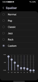
There is the baseline Dolby Atmos available (so not the enhanced Sony/Razer version) with a bunch of pre-set options in the usual way - Music, Film, Game, Podcast, Smart (auto) or Custom (though actually there’s a ‘custom’ available for all the other settings anyway). Drill down and you get a bunch of manual sliders for bass/treble, a few more presets - Bass Boost, Vocal Boost, Brilliant Treble (depending on which pre-set you’re in) and the most useful toggle of the lot (especially when using headphones), Motos’ Sound Virtualiser. This makes a huge difference to stereo ‘width’ (which they call ‘surround’) and in my experience with Moto phones, is always worth having on. It’s certainly worth playing with these settings (which can’t be turned off completely - only to ‘Smart’) as it can transform (particularly using the speakers) a ‘flat’ sound into something with more character and body - probably more than other phones’ systems. (Incidentally, this all looks identical on the Ultra to me with similar impact in use.)
Bluetooth 5.2 is supplied here and as we would expect, sound via that route using headphones or other connected gear (or even cabled via the USB-C port) sounds fabulous. (There’s no 3.5mm audio-out socket, incidentally.) As good as pretty much any device these days - it seems that this is a quick and cheap way to get great sound out of devices. All the above controls are available in the same array (not dumbed-down for speakers, up for headphones, like some systems). As always, the output depends on the quality of what gear is connected, peripherals having their own smarts and processing hard/software. Testing here with Sony WH-1000XM4 and AKG K701 headphones, wired and bluetooth as available. Few will complain about the quality of sound with headphones, however they connect. For business people I have tested the output with the Anker S3 Conference Speaker I have here and it works perfectly well, sitting on a table, as I imagine a bunch of architects in London liaising with their counterparts in New York!
The 5000mAh battery is staggeringly good. I have tested and retested my 10% screen-on Reading Test and I’m consistently getting two and a half to three hours, never (with my average use) getting to bedtime with less than 50% battery left (which, for me, makes it a genuine two-day phone). Everyone’s use and therefore results will be different, I do realise - for someone on a long day out shooting video or (more likely) attending a weekend conference retreat with colleagues to discuss the production values of their manufacturing plant in Kuala Lumpur, for example! Motorola always seems to excel in this department and this is no exception, up there with various of their models over the years (along with the Pixel 5 and 7 - and even, as recently discovered here, Samsung Galaxy S23 - link to my review). I’m more than happy with the overnight 15W Qi Wireless Charging on my night stand, assuring that I’m never likely to need to use the supplied 68W TurboCharge brick (the same that came with my Motorola Edge 30 Neo) and cable. In my tests, however, with this, I have been able to charge from 0-100% in under an hour (and roughly 75% in half-hour). This is not as fast as the 125W brick supplied with the Ultra but certainly useful all the same as a backup on those long business trips.
The camera setup is purely functional it seems with very few bells’n’whistles, outgunned at every turn by the Ultra. I guess that it is assumed that people at work will be unlikely to be getting creative with a camera in their phone and it will be much more likely to be utilised for activities such as snapshots of paperwork, PDFs, whiteboards and video for Skype/Teams meetings. As I said earlier, the audio capability seems to be very much up to that and (for that purpose) video shooting too. I maintain that the average consumer would be absolutely fine with the setup, however, taking photos for social media and passing round to be viewed on screens, but for those who are now expecting 200MP sensors, 10x Optical Zoom, high resolution wide-angle options and more - they will be sorely disappointed with this basic array. The main camera is a 50MP f1.8 one with OIS, it has a wide-angle 13MP f2.2 secondary and one of those throwaway 2MP f2.4 ‘depth’ cameras which seem to be doled out to every budget phone, even under £100, here assisting with portrait mode. There is 8K video shooting available at 30fps or 4K at 60 - and even 4K@30 in the 32MP f2.5 Selfie around the front. It looks like Moto have worked out that anyone using this phone is much more likely to want half-decent video for their business applications/meetings than to take snaps of uncle for granny - which is fair enough! For me, this is just fine as I don’t care much about taking photos with phones, but I can imagine others being rather nonplussed. The same approach as the phone’s speakers, I guess. Saving money on build by chopping down the quality of the components that the firm think that the target audience/users/buyers won’t be bothering with.
However, having said all that, the Moto camera app has got plenty of fun stuff inside and functionality for those who might want to push it. The Night Vision seems to do a decent enough job pulling light when there is none to be had, practically - at the price of noise (don't zoom in!) in the results (depending on level of darkness). The portrait mode now has 24mm, 35mm and 50mm labelled settings (Sony style) which actually do make a difference to options in my experience here, there’s a so-called Macro across many of the shooting modes (which does tend to hunt around a lot and is not as good as what is found in the Ultra and Neo). Plenty of other stuff we’ve got used to with Moto too, like Spot Colour, decent document scanning, dual capture and so on. You can edit the icons in the menu and deeper-dive into Settings for more bells’n’whistles. Shooting in 50MP Ultra Mode produces file sizes of around 10MB (obviously nothing like the Ultra’s 200MP at 30MP and more)! There’s no OIS for video shooting, so results may vary with the 8K/4K. Anyway, as usual, I’m going to hand over to those who know what they’re talking about with regards to digital photography from phones at GSMArena. Do click through, starting here, to read their excellent deep-dive with samples, videos and much testing. Do be aware though that they pretty much sound out my thoughts - that this is not a photographer’s phone and Moto don’t have that target audience in their sights. It’s perfectly functional for business use (particularly the selfie for meetings) and the rest of us, snapping for social media.
Connectivity seems very good as usual with Moto. Cellular voice calls checked both ways sounding very good, signal firm, and data over cellular as reliable as it is with a broadband router, checked with two here. WiFi 6e is available for those who can make use it. Bluetooth range seems very good as well, with the GPS aerial locking onto location as required and hanging on to it, updating quickly. NFC seems to do the job when paying at Tesco and hooking up quickly with my headphones.
Much as I love this phone - as I really do like what Motorola does with Android - I do wonder about the rationale here. The whole ‘business’ thing. And the vastly overpriced options for consumers. £900 from Lenovo’s website, but we have now seen it for £499 via ‘educational’ routes. Why not just price the thing somewhere in the middle (which would be perfectly valid for what the user gets), let consumers buy it freely, sell a shedload more of them and thereby making it (potentially) a bestseller! The ‘business’ stuff can be ignored (and is actually pretty invisible once the Microsoft apps have been uninstalled anyway) or embraced by employers’ IT departments to make the most of ‘fleet’ services available, as an aside. And let’s not forget that ThinkShield at least is available across the Moto range anyway.
It’s great to have the rugged protection for both business and consumers, though plenty of consumer-grade phones now have IP6/8 too. Are business people really going to utilise the whole Ready For thing widely? I’m guessing that it’s likely to be more of a consumer activity (though to be fair I have not been able to see what the business tools available for companies bring to the table in the system). The Red Button is very handy, of course, but again, not sure how much of a ‘business’ thing that is. More likely an off-roader or elder’s SOS function, I think. Certainly for business the ongoing support (assuming it comes and they are good for their promise) and fabulous battery life are going to be very useful, along with the wireless and nice fast charging - though the camera and speaker setups certainly wouldn’t be considered consumer-friendly these days.
It does make me wonder if most of this is really all about marketing but remains an odd outlook/target. It certainly will be interesting to see how many sell - if the majority are being sold for cut prices to business/education anyway, I’m guessing not that many. Perhaps they haven’t made that many. Unless they do open it up to consumers and roll the dice at, say, £599/£699. However, don’t get me wrong, it’s a perfectly good phone (in fact, I love it) and well spec’d too. Again, I think that Motorola does a great job with Android, keeping it pretty clean yet adding genuinely useful apps/services/functions. I could easily see myself adopting this phone for my personal use and in some ways, as depicted above throughout, the Ultra is arguably better specified - though less rugged of course and certainly more physically vulnerable. The ThinkPhone is very highly recommended if you can get hold of one (or have deep pockets).


