Motorola phones, over the years, have always caught my eye and encouraged me to part with my 'well-earned'. There have been some exceptions and frustrating parts of the long-standing affair, but generally I'm onboard with what they do with Android, how they do it, what they add to the experience and the very nicely thought out hardware choices - usually at decent prices, especially since the hook-up with Lenovo.
I recently bought the Motorola Edge 30 Neo and found it very hard to fault in my review in November, especially for the (now) £299 price-point. The Edge 30 series has enthused me, specifically, so I was delighted to receive a review unit of the Edge 30 Ultra from Motorola PR in the UK here to review as well (known in China as the X30 Pro). The third in the range is the Fusion, which seems to have a bit of an odd feature-set in some ways, but sits between the Ultra and Neo. I have not seen this one yet.
One of the frustrations about Motorola over recent years has been promises of OS and Security updates. I'm still sitting here with a 2020 Edge Plus, a premium £1000+ flagship, then exactly two updates after launch, it was suddenly abandoned by the firm. That's not good - and it seems that Sony have now emulated the practice with their Xperia range. Motorola seem to have woken up and smelt the coffee this time round though and have, at least, with the Ultra in the Edge 30 range, promised 3 OS updates and 4 years of security. A step forward, but we'd like to see this now for the non-flagship units too, which Samsung have now committed to across most of their range. Please Moto!
Their argument is that they can keep prices down if they only spend time and money on keeping up to date the devices that they know that most people are using, which they can track, and not wasting effort on the devices that are no longer used in such big numbers. They also, of course, want people to buy new devices from them, and seem to think that everyone changes their phone every two years. That landscape is changing and it looks like we see the firm adjusting their approach in reaction to that change. Good.
Anyway, back to the topic and journey to discover whether or not the Ultra can nab my SIM Card from the Neo (where it has been most often since November). Note that I say SIM Card because the Motorola Edge 30 range don't yet support eSIM functionality, so anyone looking for that needs to look elsewhere for now. They, along with most others, will get there in time - as sure as they will drop 3.5mm audio-out sockets and microSD Cards!
The plastic-free box that the phone came in is an eco-friendly looking one, tree-bark coloured to emphasise the point, and inside we have a pokey-hole key for the aforementioned SIM Card tray, a soft and flexible TPU case (well done Moto) and the star of the show - yes, in the box - a 125W TurboPower charging plug and thick, supporting USB cable. Perhaps that's where we should start because it's a mightily impressive option to have for charging.
In testing here, I have been able to charge the phone's 4,610mAh battery from 0-100% in 22 minutes. I do realise that there is even faster charging out there from some Chinese OEMs for some phones, with the arrival of 240W charging, but I'm not sure that in real world situations, what the difference is between 22 minutes and 9! It's still super-fast! Furthermore, unlike some OEMs who will only enable the functionality with their own brick and cable (thinking Oppo and OnePlus VOOC) I have been getting very nearly as fast speeds with my more generic USB cable and GaN 100W charger with the Ultra here. So yes, Turbo-fast charging when needed. But there's more...
Wireless charging, trickle for most of us overnight, but for those who fancy buying a 50W Qi Charger, the Ultra will support that as well, so even super-fast charging speeds on the stand/cradle too. At time of writing, in the UK, it's hard to source Moto's own 50W stand, but others can be purchased. Apparently, the Chinese authorities decided to 'cap' wireless charging at 50W - but that's a story for another day. We don't all need Turbo-speed charging all the time - and there are arguments against, for the long-term health of batteries - but it's great to have the option when needed, out and about on busy days. There's also 10W Reverse Wireless charging available for topping up your friend's phone or earphones on-the-fly.
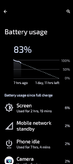
The battery performance, however, seems to ensure that unless a person is caning the phone shooting hours of 8K video or heavy gaming, it should last most people in normal use at least a day and with moderate/light use, two. I have been tracking this for the last couple of weeks and am getting 48 hours of battery with 6-8hrs screen on time. One day I had of very light use returned me 14 hours away from the charger with 2 hours of SoT and a whopping 80% battery power left. Clearly, stand-by time is exceptional with this phone, even with a power-hungry chipset and big, bright screen to drive.
My 10% Reading Test returns me about two and a half hours, so not quite as good as the Neo, but still very good indeed and much better than the Samsung Galaxy S21 Ultra. I am planning, incidentally, a Battle of the Ultras with these two devices sometime soon, so watch out on my blog here for that. There has been one caveat pertaining to all the above however, and that has been some strange readings from the onboard status bar percentage readout. During the first few days, it was clearly displaying data that couldn't possibly be the case, like remaining on 100% after 6 hours of use - but as it has settled down and got used to my usage pattern, it has become more reliable. I think it is a bug though, which needs to be sorted out in software updates as we go forward.
Hopefully we shall be able to keep the device long enough to see Android 13 arrive and a good number of monthly updates to iron this out. In the meantime, I would suggest that users turn on all the battery assist functions in settings - Adaptive Battery, Optimised Charging and Overcharge Protection. I have done that since discovering these issues and it does now seem a bit more reliable. So, all the figures above, should be viewed with this in mind. I shall come back and report on changes as software comes in, as long as PR leave the phone with us.
The phone was released in September last year on Android 12 and has now, as I write in January 2023, had December 2022 Google Security pushed OTA to it. I would expect Android 13 to arrive in the first quarter of 2023, but we'll see. I'll come to the software experience later but for now, I'll return to the physical, having leapfrogged it initially, drowned with enthusiasm for power and charging!
The phone feels totally premium in the hand, it's reassuringly hefty at almost 200g and sized much like an 'Ultra' phone. There is 'only' IP5/2 environmental protection although I understand that Moto still do the nano-coating internally to make things better than they seem - but officially, yes, it's 'splash resistant'. The front and back are made from Gorilla Glass 5 and there was a factory-fitted screen protector on, out of the box. These just get in the way! Take it off! It's true that GG5 is not Victus, so may be more susceptible to breakage, but micro-scratches are hard to avoid whatever the screen tech, we have found. It's very similar in size to my Motorola Edge+ (2020), except that it's a bit wider, as although they have the same screen size, the older model has wild 'waterfall' edges left and right, which make it a little narrower - but there's not much in it. It's also not far off the size of my Samsung Galaxy S21 Ultra, but the latter is a bit wider and fatter, making it feel/seem like more of a 'lump' in the hand!
The back and front curve around to meet the aluminium frame which becomes, unlike the Edge+ (2020), centralised and very thin. This makes the volume rocker and power button on the right very slim indeed, but also premium-feeling, no play, solid. There's nothing on the left side except antenna-breaks, as there are all round, and down at the bottom (which, like the Edge+ is flat and for those brave enough, can be stood on-end) is the 'right' speaker, a centralised USB-C port and a dual (back to back) 5G nanoSIM Card tray. At the top, in the middle is a subtly etched "Dolby Atmos" emblem/logo.
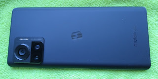
The back of the phone appears to be the most slippery surface known to humanity! I thought the Nexus 4 was slippery, but this takes the crown. If it wasn't for the camera island, it would simply slide off flat surfaces. Work that one out! It's a beautiful, velvet-like texture, matt, somehow, not even glossy. Very classy - but making it essential to use the included (very tight-fitting) TPU case. There's the usual Moto 'M' in the middle of the back, the word Motorola low-down, subtly etched into the glass and top-left (in portrait), the camera island.
The camera island is a three-tier unit, stepping up like a wedding cake! On the first layer we have the LED flash and words, reassuring the user that there's a 200MP camera in the cluster with OIS. The second tier houses the supporting two other camera lenses and the final 'top' tier, the 200MP camera itself. This is surrounded by (what appears to be) a metal ring, sitting proud of the glass - but even with the supplied TPU in place, it is not protected from touching a flat surface. This means that when the phone is placed down on a table/desk, it hits this ring. Hopefully this isn't damaging the camera in any way, but it will be interesting to see, over time, if there are scratches/dents in it.
The front of the phone is an almost flat, black, sheet of glass with those slight curves around the edges, left and right. There's a narrow 'slit' above the screen which serves as the earpiece for calls and the 'left' speaker for media. There are almost no bezels left and right (and they are 'round the curve' anyway). Similarly at the top, with a very slightly bigger one at the foot of the screen. There's a Selfie punch-hole camera top/centre which is not too intrusive - I've seen smaller and bigger - and as we know, our brains learn to not see it!
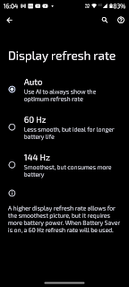
The panel is a 6.67", 1080p, p-OLED unit, like the Neo's, with a billion colours and a 144Hz Refresh Rate. I wish I could tell the difference between this and 90 (or even 60) but those around me report that it does indeed make a big impact for them, so 144Hz is certainly up there with the leading pack. The user can choose between 60Hz, 144Hz or Auto, to let the system decide (which does then include 90). I think that the screen is the same stock, only bigger, of the one on the Neo - they look the same to me. Bright and colourful with saturated, rich colours. It has a screen ratio of 20:9 and returns 395ppi. One difference between this and the Neo is that whilst the Neo 'only' peaks at 1000nits of brightness, this can reach 1250nits (though on further research, this seems to be only in certain conditions and only in the whites, reaffirming to me that the Neo has the same panel tech, pretty much). They are excellent, both, and up against a Samsung phone, with some uses, they look even better - which is praise indeed for LG who we do believe still makes their p-OLED panels for Moto.
The phone has the all-but bang-up-to-date chipset in the SnapDragon 8+ Gen 1 (4nm) and you can tell. The power and speed when executing heavy-lifting tasks like copying data to a PC, updating apps, playing games and so on - it simply flies. This does represent one differences from the Neo, for sure, with it's power/budget-friendly SD695. The 12GB RAM helps the multitasking with the likes of Ready For when hooked up to a PC/TV or NexDock device and when keeping many apps open in the background for quick-switching. My next article relating to the Motorola Edge 30 range of devices here on my blog will be focused on Ready For (cabled and wireless), by the way, so look out for that, coming soon.
There are a number of variations of the phone available in different regions, the 128GB Storage/8GB RAM version appears to available in India only, there's also a 256GB/8GB version, the only one that I can find for sale in the UK is this £749 256GB/12GB unit and somewhere out there, there's a 512GB/12GB version! There's no microSD card slot, but even the lowest 128GB version should be enough for most folk, not pushing limits. I'm quite happy with 256GB with the HDMI-Out functionality, downloading streaming services' media content for later viewing offline. As I say, I'll come to that in another post. The storage is UFS3.1 rated and read/write speeds seem fast to me, compared to some others which don't support that protocol.
The output from the stereo speakers sound very similar indeed to that from the Neo. It's a bit fuller - I'm guessing because of the bigger, metal/glass frame affording more space for the sound to move around - but there's not much in it. They really are (both) very good indeed. I've been comparing the output with the Sony Xperia 5 Mk.IV and Motorola Edge Plus (2020) and the results are surprisingly comparable. The volume is really very loud - as top-notch as the Edge+'s reproduction. Users can employ the Bass Boost (particularly) in the Dolby Atmos Pre-Sets or use the excellent Wavelet app to achieve similar. Whichever method is employed, you get to that same equation of quality/volume. I was surprised, however, that whatever I did with the output from the Xperia, I preferred the sound coming from this Moto, £250 less to buy! Yeah, I know, there's lots of other stuff you're paying for with the Sony too, but up until now I really thought that the Mk.IV was only going to be beaten by my Edge+, not coming in 4th here behind these three Motos!
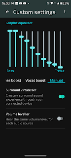
The Dolby Atmos settings are the extended set, so lots of control over speakers as well as headphones - including full manual sliders - and yes, they really do make a difference with the right combination. They also continue to make available the Surround Virtualiser which, again, makes a significant difference to the stereo impact with both music soundstage/width and video/film with decent soundtracks. Placed 18" in front of the head and the listener can appreciate some clever software-driven speaker output enhancement going on, which is most impressive and enjoyable. This unit is equipped with Bluetooth 5.2, so a slight step up from the Neo's 5.1, utilising A2DP, LE, aptX HD and aptX Adaptive.
Connectivity is sound, it seems. The Bluetooth range seems to be solid, depending on quality of connected equipment of course, NFC for connecting to other gear seems to work as it should along with Google Pay - and cellular connectivity seems very good indeed. I have had various phone calls over the last fortnight and it didn't flinch, the whole time. When it comes to WiFi, Moto have equipped the Ultra with 6e, so right up with the latest (for those who can make use of it) unlike the Neo, which is still having to use the v5 protocol. I have not noticed anything wrong with my connection, good and fast with no hitches or blips. There's 5G connectivity on the phone of course but I'm afraid that where I live I'm unable to test that. I'm more than happy on 4G though - there's nothing I do or nowhere I go which makes me think that I might need 5G but I guess everyone's lifestyle is different. I might be worse off in a football stadium than those with 5G. If I went to one!
I've always quite liked what Moto do with their Camera software and this is no exception. The headline here is the 200MP f1.9 camera with OIS which my colleague Steve Litchfield at Phones Show Chat put to the test and you can see his video coverage here. Shooting at full resolution produces excellent results, although user beware that unless you specifically want/select that (with much, much bigger file sizes) the unit will default to pixel-binning down to 12MP shots. Which are still very, very good indeed, incidentally.
The supporting shooters are a 2x optical zoom through the 12MP f1.6 unit and a 50MP f2.2 wide-angle lens. There's even a 60MP f2.2 Selfie - so for anyone keen on top-notch photos, they will no doubt find the differences from the Neo here significant. In my tests I think that all the cameras shoot fine pictures, certainly in good light, and the wide-angle at 0.5x too. The jewel in the crown for me here though is the close-focus, dubbed 'Macro'. It's really very impressive, very similar to the Neo's, compared to most others which I have tried here. There's a 'Macro' badge present in most modes on the main view next to '0.5' and '1' and it seems to switch to the wide-angle lens when you get close enough. There are plenty of manual controls to override this and use it how it suits.
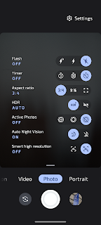
The Night Vision seems to work very impressively - you are led through that 'hold still' procedure, then watch as a photo appears - with subjects in the frame that even the human eye can't see! The shots are just great. The portrait mode seems to do a decent enough job with controlled depth of field - and you get that fun Spot Colour toy to play with along with a bunch of other modes too. You can edit which modes you want to see on the main view (Samsung style) and dive into settings for a bunch of other tweaks and adjustments. Unlike the Neo, there's 4K (60fps) and 8K (30fps) video shooting available and even 4K at 30fps via the Selfie.
Anyway, I shall soon be out of my depth with digital photography, so I shall do my usual trick here of handing over to the folk at GSMArena who do a great job as they test, prod, poke, sample, assess and conclude. They seem to always know what they're doing (much more than I could) which is why I refer to them so often. Do please support them by visiting their site for the latest mobile news and to tune into their excellent phone reviews.
In terms of device access security, we have an under display, optical fingerprint scanner and face unlock. The fingerprint scanner is thorough in setup and works pretty well, though I think not quite as well as the ultrasonic of some Samsung models and certainly not physical, capacitive ones. But the technology/software does seem to be getting better. The Face Unlock is even more thorough - like with the Neo, it just won't let me register my face with my full beard. If I pull a stupid grin, it sometimes starts the process, but never gets to the end. In order to make this work (I kid you not) I cut my beard off! Then, it worked fine and continues to work, recognising me first time, every time. So the combination of both of these is excellent. Obviously people who use Moto phones are not allowed beards!
Moving to the software experience, the usual set of Moto features and gestures are onboard here with chop-chop for torch, twist-twist for camera, 3-finger screenshot, Lift to Wake, tap to wake, Attentive Display (stays on when looking at it), flip for DND and more. The excellent Peek Display is here too, where the sleeping screen can be interacted with to see summaries of notifications or deal with playing music and a bunch of other stuff. It's not a true Always on Display, but it's the next best thing - and in some ways, better. It does seem that Moto have done away with the Approach feature for good now, which enabled a wave over the screen to enliven it to Peek, but I guess they figured that if the waving hand is there anyway, it might as well tap the screen. Fair point.
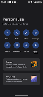
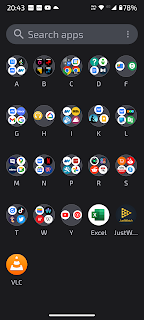
You get the personalisation options of layout, font, colours (like Material You), choose Icon shape, system theme and more. This is well thought out and in keeping with what Google are doing on Pixels (and now others when Android 13 arrives). All good stuff and very Samsung. Edge Lighting is another great Samsung feature which is present here, but not in the Neo (as it needs a screen that's not flat to qualify with Moto). This gives the user a choice of 5 colours to 'glow' the edges on notifications from a list of options. Another way Moto is getting more Samsung-like, I noticed, is with App Drawer 'folders'. Yes, you can now arrange your App Drawer in the same way you can as if it's on the home screen, thus becoming another home screen, I suppose! Colour background for folders should be next, with a 'hidden apps' area!
The Backup/Restore works pretty well phone-to-phone using Google's tools - either wirelessly or by cable. This is another area where the user can see how fast the phone's processor is as it whips through the copy-over task. There are a couple of apps pre-installed by Moto here, probably depending on region, but for the UK it was FaceBook and a Solitaire game (which appears to be an app-link to a 3rd party). However, both are uninstallable, so that's good. There was another apparent bug in my unit during this process when the process got stuck halfway through, a reboot fixed. I don't know if that was Google or Moto - either way, it would be good to see that ironed out in a software update.
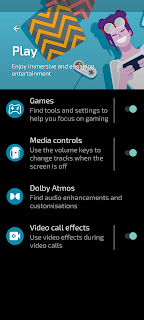
Gamers have some special settings to enhance their enjoyment with a dedicated Games front-end (app) where installed games are automatically included. Launching from inside that wrapper then sets things going and Moto presents an icon on the left which brings forth a little gaming control panel, with controls for volume and brightness, blocking buttons for calls and notifications, a dedicated screenshot button, share, touch sensitivity and even one to launch live Twitch streaming, for those who want to do that! As an aside, and going back to sound/speakers, the sound coming out whilst gaming seems even better and louder than via music and video, as tested earlier. Good job Moto!
The software experience is otherwise very close to Google, to Pixel, to AndroidOne in many ways and not veering off into a multi-layered virtual OS of it's own, like Samsung. Some will see this as positive, while others will appreciate the bells and whistles of the latter. For me, it feels like a good balance between the two and I end up liking, very much, the Moto approach.
The Motorola Edge 30 Ultra is a great phone and worthy member of the Edge 30 family. My primary daily phone just now is the Motorola Edge 30 Neo and the big question for me is about size. The 6.28" screen on the Neo is just about perfect for one-handed use, whereas the leap up to 6.67" here, though not as big as some Ultra models, is quite a change. When I try to reach the top of the screen with one hand, it's a stretch. Moto have dropped down some of the screen elements, like Samsung with One UI, and there is a perfectly good one-handed mode (swipe down) but it's also about balance in the hand and weight distribution. So, something to consider.
The phone is more powerful, there is no doubt, with an all-singing modern chipset and more RAM, and the user gets full access to wired Ready For with the Ultra instead of just the wireless version (which, as I said above, I shall cover separately). There's more storage, that 200MP camera, a zoom camera, in fact - better cameras all round and a faster charging battery. On the other hand, the Neo is significantly cheaper, has pretty much the same lovely p-OLED panel, 68W charging with brick in the box and, it could be argued, is less vulnerable to accidents with a flat screen instead of curved and a plastic body, more ready for the rough and tumble!
Both of these phones are cracking devices. The Neo punches way above its weight, but for ultimate power, with every box ticked, pretty much, it's the Ultra. Both of them highly recommended.






No comments:
Post a Comment