My ears prick up whenever my nose gets a sniff of someone pushing things forward with speakers on phones. The HTC One (M7, M8), Marshall London, Razer Phone, ZTE Axon 7, a Zenphone here and there - over the years OEMs have tried, but even powerhouse Gaming Phones don't always cut it. This is why I was keen to see how the new Poco F4 GT measured up.
There's much more to a phone than speakers and sound of course - in fact, many have no interest in speakers in this world of cheap and good Bluetooth options and perhaps they have a point - so I was also keen to see what the Poco offered as a phone for general use too. I'm no serious Gamer, but will try to appraise the features here for those who might be in this kind-of gaming phone which feels more like something of a hybrid. An 'ordinary' phone which would appeal to some lower-level Gamers - perhaps like me!
The bright yellow box with black trim it arrived in is presumably a nod to motor sport, taking into account the GT bit in the name and those Gaming leanings. You get the phone, a simple but very well-fitting clear TPU case, a 120W charging brick (which I'll come to), a very long USB-A to USB-C cable (with a right-angled plug on the end to plug into the phone so it gets out of the way of Gamers' hands), the usual paperwork and pokey-pin for SIM Tray and also a simple-looking USB-C to 3.5mm audio-plug adapter. Yes, you guessed it, there's no traditional audio-out port. There's a pair of basic-looking wired earphones here too - 3.5mm on one end (so not USB-C), in-ear-canal style speakers on the other and an in-line 'remote' controller in the wire. Good box contents compared to many these days.
I have the 256GB version here with 12GB RAM but there's also a 128GB version with 8GB RAM in some regions too. There's no microSD Card slot here, so users choose carefully. The 'proper' price here in the UK is £699 but at PSC Towers here Steve Litchfield was able to snag this for £399 on an Amazon Prime Day! On the face of it, £300 off and a real bargain. This one is Stealth Black in colour, but there's also Knight Silver or a Cyber Yellow one floating about if you can find them. We fancied a yellow one, but sadly we couldn't get one. Still, the conservative black is much less lairy!
The phone itself is not small but because of pretty small bezels around the screen, it seems to defy its 6.67" screen size. It feels very classy with an aluminium frame, glass front and back (Gorilla Glass Victus on the front) and a hefty 210g in weight. Of the phones I have kicking around here at the moment, it's very comparable in size to the Samsung Galaxy S20 FE but a tad fatter. There's no official IP-rating here so user beware.
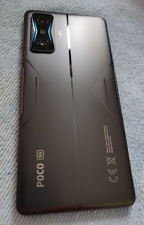
Much of the phone is orientated 'sideways', though not to make it more a like a 'proper' camera (and encourage landscape photography) this time, but more to acknowledge the Gaming leanings, assuming that this will mostly be executed in landscape with a hand at each end. This notion is clearly supported by the inclusion of physical, magnetically-controlled pop-up 'triggers' (which I'll come to) where the index fingers will fall when held this way. There are accents and design elements across the back which suggest 'forward' and 'speed' many in 'V' shapes, even surrounding the camera island, top-right in landscape, which sticks out about a millimetre.
Printed on the back are the words 'speediest' and 'freezing' (whatever they mean). If you get your magnifying glass out you can read them, each side of the camera and next to the LED Notification lights which can be assigned in terms of colour (on a sliding scale), frequency for incoming calls, notifications and in gaming. You can also schedule it if you like (perhaps to not do it at night). Nice touch, but it'd be much more useful on the front!
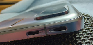
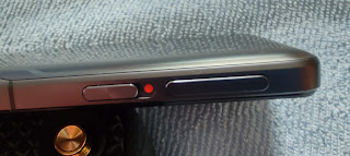
On the same 'top' side of the device alongside the triggers is a capacitive fingerprint scanner/power button. On the opposite side we have the volume rocker (so 'bottom' when Gaming) and a SIM Card Tray. On the bottom is a USB-C port and - here's where the fun starts - two of the four 'stereo' speakers (which I shall certainly come to) with the other identical pair up the top (so in landscape, they're towards the top, on the sides, just under the index fingers on the triggers.
The 6.67" front panel is an AMOLED one which can refresh at 120Hz. It's decently colourful and bright, but not up there with my Motorola Edge+ which I consider to be the Gold Standard these days. It's got a 20:9 ratio, is 1080p, so not the 1440 or more that Gamers might be looking for, and returns 395ppi. It feels as though some corners have been cut here to keep the price down, not trying to compete with ROG Gaming phones, for example - rather keeping in the company of the likes of Black Shark. It's really fine enough though and outside in sunlight I can still happily see/use it.
The colours can be adjusted in the usual ways, Vivid, Saturated etc. with temperature adjustments, cool, warm and so on - as usual I don't see much difference between them, but then I can't see the difference between 60Hz and 120Hz refresh rates still (I'll take the battery-saving), whatever I'm doing on phones these days and however much further I sink into my minority bucket amongst my tech-orientated friends! Anyway, here's a tip for you - remove the nasty factory-fitted screen protector as soon as you get it out of the box! It makes the screen horribly unresponsive - you'll wonder what's wrong with the thing and send it back! It's got Victus glass anyway, so I really don't see the point. Without it, the screen is beautifully responsive.
The phone is powered by the SnapDragon 8 Gen 1 (4nm) chipset and it simply flies in every department. I have played some gaming, car-racing to test for example, and there's not a jitter or judder anywhere in the experience. I realise that hard-core gamers will push it harder than me, but reports from users seem to say that there's no lag anywhere. The one thing that more of them are complaining about is the generated heat. That powerful chipset when in flight is clearly working very hard and even with my level of use have found this to be true - it does get warm sometimes, though not silly-hot. There is an advanced cooling system (dual vapour chambers) built into the phone, so I dread to think how hot it'd get without that in action!
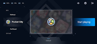
The 12GB RAM keeps much of the phone's previously-used apps running, only interrupted by optimisations available to Gamers when in the 'Game Turbo' mode. As we've seen on other gaming phones, a dedicated monitor area and panel to switch off all sorts of other phone settings to concentrate on the matter in hand. Performance optimisation, WiFi speed boost, battery management, you get the idea. If you need more RAM, the phone does offer the 'virtual' RAM extension system which is becoming popular, by borrowing 3GB from the storage and using that dynamically. 12GB not enough? Really?
The shoulder triggers are beautifully designed. They have little sliders next to each and pop up just a millimetre - enough to use comfortably and assign to functions in games without having use on-screen buttons. They 'click' delightfully and during games which will make the most of them (many don't) they are an interactive dream. They lend themselves to first-person-shooters where the left might be 'aim' and the right, 'fire', for example. Some games give more control than others but few only rely on two buttons, so there will also be some on-screen touches needed. They're pretty pointless with many other games like pool, pinball, golf or Angry Birds for example - sadly the kind of general limit of my gaming prowess! This is probably not the phone's primary feature for me! But I can imagine it would be just fabulous for the right gamer playing the right games. And they are gorgeous! Oh, there's also a wild vibration motor in the phone which will do loads to enhance gameplay too.
You can also assign the two triggers for general use outside of gaming, but I'm not sure who would use that functionality. You can assign each to a launch a limited number of functions: camera, record a video, record the screen, record audio, turn on the torch, invoke Silent Mode or control the Vibrate. You have double-press and press-and-hold for each button so from that list clearly four of the functions can be assigned. The problem here though is that before you press it, you have to also slide the catch, so every function actually involves 'opening' the button first. I guess it could be useful for an emergency torch - move the slider by feel in the dark, then press it (instead of fumbling around on the screen).
The four speakers are arranged symmetrically as I said earlier. There's a Woofer and a Tweeter at each end of the phone, so technically 4 speakers, and they sound great to me. I was really very impressed with the sound output. Testing here with a mix of tunes it does pretty well with bass but more delightfully with the mid-tones. Solo piano, classical and jazz sound great. Loud, rich and with body. As always, everyone's ears are different, everyone's leaning towards the sounds they like will influence how much you like it, but for me it's super.
I put it up here against the best-sounding phones I have to hand, the Motorola Edge+ and Sony Xperia 5ii. The Poco is louder with better bass/general 'tone' than the Sony, though I do really like the clean reproduction of piano on the Sony. I was close to calling it a draw with the Edge+ though I think that maybe the Poco has a tad more bass even though I do prefer the mid-tones again of the Edge+ like the Sony.
All three are pretty close in many ways. I lean towards those mid-tones, but when gamers are wanting to rumble through a game's sounds, I can see why they'd prefer the Poco. It's a great sounding phone and I'm very impressed. The stereo balance is very well tuned, soundstage wide enough for arms-length use and the system-wide Dolby does give the user further enhancements - available for head/earphone use and the speakers.
Headphone use is not terribly impressive with the supplied 3.5mm dongle and my usual reference AKG K701 headphones. I get the impression that although the reproduction is fine, the target user here won't be impressed with the top volume and will want to get enhanced DAC of some sort involved. Furthermore, when I tried my 32-bit enhanced-DAC dongle the output was just the same as with the supplied one. We conclude that Poco is somehow rendering the use of enhanced audio via the USB-C port invalid. Bit of a mystery. Clearly the "24-bit/192kHz audio tuned by JBL" doesn't apply here. Turning to Bluetooth and the experience is excellent, as we have now come to expect. Bluetooth 5.2, pairing up quickly and easily, job done. I guess they're expecting gamers to adopt that route. They might be wrong though!
Apart from the shoulder triggers, the other selling point here is the fast charging. And that's a serious understatement! It's a 4,700mAh battery but apparently it's been split into two halves. So presumably 2,350mAh x 2. This has been done in order to make all the electronics work to gain this ludicrously fast charging speed - 0-100% in 17 minutes! Furthermore, the 120W charger to achieve this is supplied in the box. Here, it's still in the box (to protect resale value) and I've not used it, but I have seen online other people proving quite clearly that it does work. I do have a 100W charger here and I got it to charge in under half an hour.
Unlike the Oppo SuperVOOC charging solution that relies on their own charger and their own cable being used every time to get good charging speeds, it's clear that this is not the case here as it works with my GaN UGreen one and generic cable. The bad news is that there's no wireless charging here, but frankly, when I have speeds like this perhaps it's time to turn tail on my long-held position on the matter! I do think that wireless charging is the way to go still though - otherwise how are they going to make the portless, buttonless slab of glass phone!
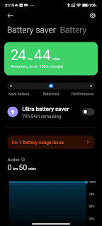
Battery performance has not been been the best in my tests here. One evening I left it on 50% battery, connected to WiFi but not cellular, 12 hours later it was dead without me touching it. As always, it depends what you're doing with the phone as to how it's going to perform. I was just about getting through a day with my average use and the result of my 10% Reading Test was about 1 hour and 15 minutes. Not the best, but then when you get in the shower it can get a blast of power, by the time you've finished, it's full again! Maybe fast charging really is going to be a game-changer. Here, in more ways than one!
The side-mounted fingerprint scanner is just perfect. The user can set it to 'touch' or 'press'. Some users were complaining that when set to 'touch' accidental brushes executed the action, but I haven't found that here in my use and I do prefer using it that way. Capacitive and physical of course, entry first-time, every-time. There's also a supporting face unlock too for those who want/trust it, both systems are quick and easy to set up.
I mentioned the storage earlier on and lack of microSD to expand that. You can of course plug in portable storage to the USB-C 3.1 port and copy stuff across or run media from the external source. I was disappointed to discover that there's no HDMI-Out support either. I know I'm in a huge minority here, but I do like to be able to plug my phone into my TV with a cable and not rely on streaming, having to use/rely on connectivity always. Not possible here. You can 'cast' of course, but in my experience that tends to try and find a way to 'stream' if it possibly can - and even if it can't find a way and resorts to playing locally stored content, there are usually lag/latency issues with lip-sync etc. I did use VLC for Android at one point and adjust the 'audio delay' to compensate, but it's a right fiddle!
There's a rubber-sealed Dual SIM Card slot of the back-to-back variety and cellular connectivity seems to be of good quality, both ends report. Data seems to be fine too over 4G (I can't test 5G where I live) and WiFi, having tested it on two different routers. WiFi 6 is present but I can't test that I'm afraid either. I do live out in a remote neck of the woods! Not too far out to know that the GPS works well enough though locking on and maintaining a good signal via various apps which make use of it. NFC is present and appears to work well for connecting to other gear and users can of course use Google Pay (now Wallet) in the shops with ease. There's even an Infrared port here for those who need to hijack a hotel-room TV for the night!
The camera is stacked-out with options as they try to make up for the fairly basic set on offer. There's a 64MP f/1.9 main shooter, 8MP f/2.2 wide-angle, 2MP f/2.4 macro and 20MP f/2.4 Selfie round the front which, incidentally, sits in a punch-hole top-centre. It's small and not terribly intrusive (especially with a dark wallpaper), so much so that I almost forgot to mention it! Steve Litchfield appraised the main camera as being not bad at all. There's no optical zoom or OIS but in decent-enough light it was producing acceptable enough photos for a gaming-centric phone.
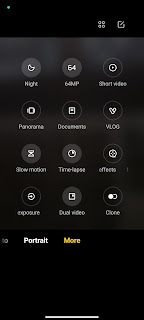
The options in the camera software really are plentiful and gives the user many bells, whistles, knobs and dials to play with! The one I was hope for more with was the Macro functionality but sadly the close-focus really isn't very close compared to many from the tiny 2MP snapper. It would have been nice to see that Macro lens replaced with an optical zoom. Oh well. Plenty else though and I was taking plenty of decent photos in good light. I'm going to do my usual trick here and point readers to the GSMArena rundown of the camera as they know what they're talking about and I don't!
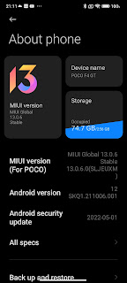
My last port of call here is potentially the biggest, but most subjective one. MiUI software thickly overlaying Vanilla Android. I do understand that these phone systems rely very much on what you get used to, what you like, evolving with a fork/branch of Android - and how adaptable the person is. All the below, then, comes with that caveat and is a personal view from someone who is most at home with a clean Android implementation from the likes of Nokia, Motorola, Sony, Fairphone et al. Before I go on, just to say that Android 12 is installed here with MiUI 13 and (as I write at nearly the end of July 2022) May 2022 Google Security.
There's an Always on Display. Great! It's not the 10-second limited nobbled one of the Xiaomi Note 10S. Great! It stays on if you want it to. Well, actually it doesn't. Because there's one situation where it just goes off, even if set to always-on. If the phone detects that the environment is dark for about 10 minutes. Then it goes off. Pah! They almost got there, then snatched away the 'bedside clock' option. During the night, charging, it just goes off if it's dark. Sigh. Always on AMOLED to the rescue.
Here's the list of software, services and apps which are pre-installed on the phone. Firstly the ones which are uninstallable: Genshin Impact (game), Agoda, Booking(dot)com, Compass, FaceBook, Joom Shopping (whatever that is), Mi Browser, Mi Remote, Notes, Recorder, Spotify, Weather and Scanner. Now the ones which are not uninstallable: Calculator, Cleaner, Clock, Downloads, File Manager, Gallery, Mi Video, Music, Security, Services and Themes. There's so much doubling-up of Google's core services and Apps that I can't see why, like the aforementioned OEMs above, they can't just use Google's. Some of theirs are very similar and even if you choose to use them, you can't get rid of the Google ones. Anyway, I did warn you that this was subjective - I'm sure the next person would point out how great Xiaomi's apps are over Google's. Moving on...
There are nags here, there and everywhere to sign up to a Mi account, use their Cloud service, there are also adverts (often full-page) inside some of their apps. The system also defaults to three-button navigation (with the Back button on the wrong side) and they put on their Nanny's uniform now and again making users wait for 10 seconds to execute an action with an 'OK' button greyed out for the duration. Treating users like children. Surely an 'are you sure' dialogue would suffice. Annoying.
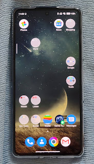
The Homepages UI doesn't allow for the insertion of 'pages'. So, if you accidentally don't leave at least one item on a page, the page disappears and you have to then copy all the items from one page to another, leaving one in place, to retain that page. Come on Poco - a simple overview and 'plus' button would do it! On a positive note, there is the option to use the Google Feed to the left of the 'home' page. Hurrah!
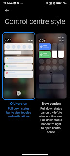
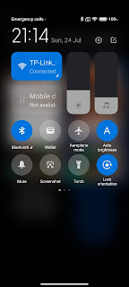
So now we have the iOS copy of Control Panel. I'm not saying it's a bad idea, I'm sure some people will like it (especially coming from Apple) but really? Swipe down from the right for Control Panel and from the left for the Android Notification Shade? Thankfully, this can be turned off and users can get back to the usual way it works. Dots on App icons is next (or Badges as they call them)! The only way to remove them (that I can find) is app-by-app, one-by-one. There's no global setting. Tedious time-waste. Incidentally, they have also gone their own way on not adopting Android 12's bigger-button iOS-style Notification Shade options. They get a point back there - well done!
I think these are my main niggles, apart from the Settings being in complete disarray, nothing like the standard Android. I get that people with long-term use of the system will get to know where things are, but that doesn't excuse the lousy search-engine which just doesn't find things and makes the user drill through manually, even when the search-string is perfect. Anyway, there's loads to like here so let's move on...
Notification (Edge) lighting works really nicely to alert the user to incoming messages or whatever is set. Very Samsung, very nicely done, though not as many options. A bit like the Sidebar for those who want to add Apps to a pull-out panel. This seems very popular and most OEMs seem to be adding their variation on Samsung's Edge Panel.
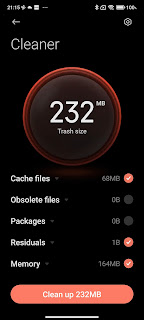
Recents is (for some reason) arranged in a grid formation instead of the simpler carousel, but OK. From here you can invoke 'split screen' which works well enough. File Manager works well enough but is really a copy of Google's Files app, Floating Windows is present, the Security App does what you'd expect, scanning the phone for potential issues and reporting back on findings, offering to clean things up, optimise, boost speed and so on, and so on, and so on.
There really are tons of software options to explore within MiUI 13 which some people will love, others will get confused about and some just ignore and get on with using the phone's apps! Probably good advice. Don't try and understand what's going on, just use your apps and be done with it! I'm being flippant, of course. There has clearly been much work and effort put into the design and style of this overlay and we haven't touched on user-generated offerings inside Themes or their idea of video 'shorts' and online content present in Mi Video. As I often say, if I had to use a phone with a UX like this for a couple of years, I'd get on with it and learn how to make the most of it. Perhaps I'm not the best person to be appraising the software experience!
However, I do like the hardware. It's got oodles of style, class and interesting features. I really like the sound from the speakers, the classy trigger buttons (even if limited use to me), the boxy design, great build, nice enough OLED panel and fabulous, addictive 120W charging! It's a really nice package - perhaps not for me personally, but for someone deep-diving into learning to use and live with the way things are done on the Poco, gaming and playing media. It's a great device. I'm really not sure that I would value it at the RRP of £699 (though I see it's already now down to £649 in some outlets), but for £399 for the right person, it's an awful lot for a great price. For £699 I'd like to see wireless charging and a 2 x Zoom in the camera setup at least, but it just depends how much a hard-core gamer is going to value the great sound and lovely triggers.




No comments:
Post a Comment